not currently taking new projects
La Bonne Fille is on a mission to bring sensuality and indungence to the fine tea space.
The design objective was to evoke a sense of sensuality without feeling tacky or overdone. The solution: a timeless, sans-serif logo identity paired with a carefully curated semi-pastel colour palette that embodies the essence of the brand. To communicate the richness that LBF delivers with every sip, I developed a simple yet elegant iconography system. Subtle nods to sensuality—without being overt—are seen in the custom pattern lining the inner cylinder, reminiscent of polkadot fishnet stockings, adding a playful yet refined touch.
I also conducted extensive research into Canadian packaging requirements to ensure full compliance and market readiness, ensuring the packaging not only looked stunning but also met industry standards and ensure market readiness.
The packaging suite included small and large cylinder containers, single-bag sachets, refill pouches, a specialty box housing three cylinders, teabag tags, tissue paper, and stickers, all harmoniously aligned to create a cohesive, luxurious unboxing experience.
Brand Identity
Packaging Design
eCommerce Website Design
Completed at The Malone Agency
La Bonne Fille


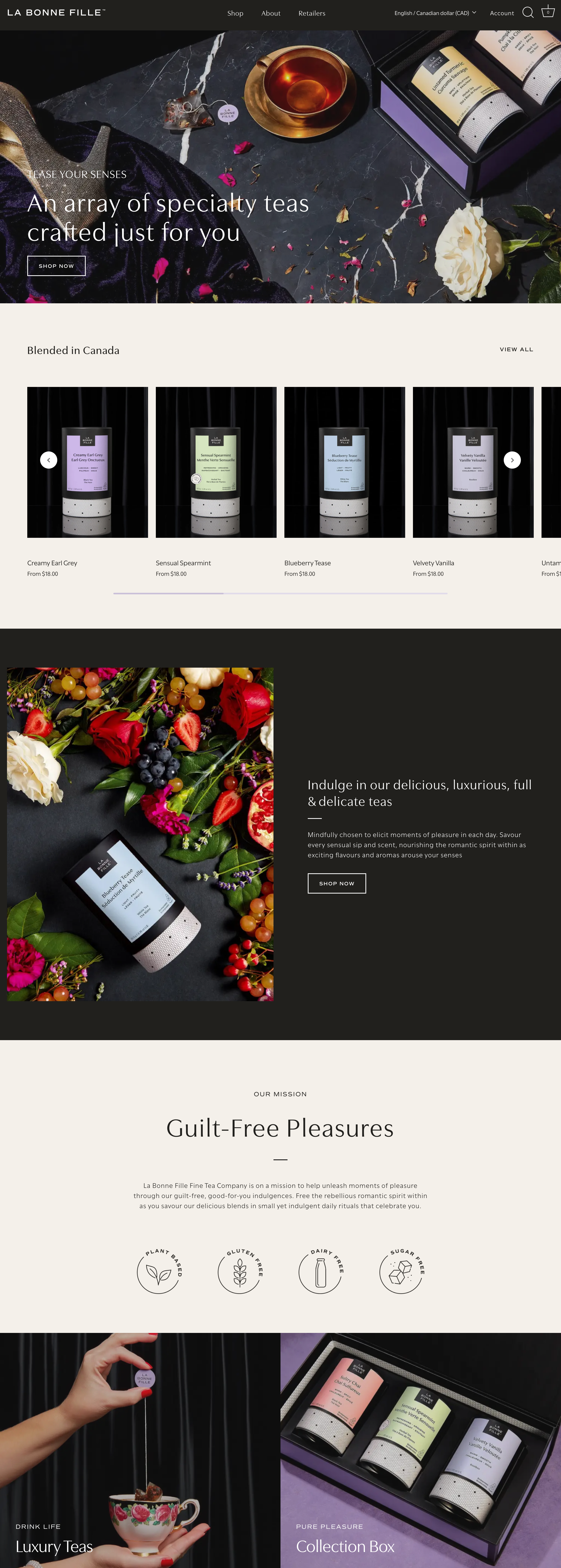
The goal for the online experience was to evoke a sense of luxury, which was achieved through seamless animations, editorial-style review sections, and descriptive and elegant iconography. These elements worked together to create a cohesive, visually engaging eCommerce site that not only elevated the brand's aesthetic but also boosted conversions. Every design choice, from the smooth transitions to the sophisticated details, was crafted to reflect the brand’s commitment to excellence and set a new standard for their online presence.